New Life Fellowship
A community organisation whose visitors are almost all on phones. The site was rebuilt around that.
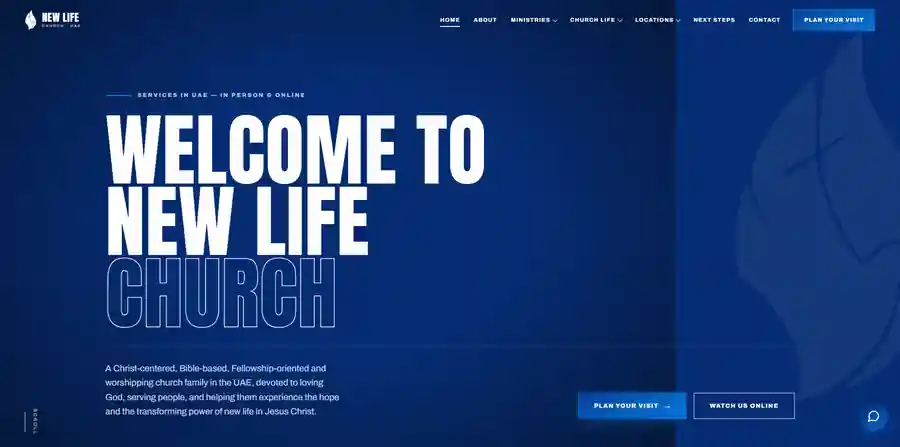
Before.
Nearly everyone arrives on a phone, but the site had been designed for desktop and adapted afterwards, which made it awkward to use.
The Work.
Mobile-first rebuild
Collapsible navigation, scroll behaviour and page transitions reworked around one handed use.
Performance pass
Load time addressed as a design constraint rather than an afterthought.
Identity refinement
Favicon, button behaviour and animation timing tuned so the site feels considered.
After.
A site that works properly on the device almost everyone uses to visit it.
How this site
performs.
A site with embedded video and a photo gallery, which usually costs a page most of its score. Nothing from the video host loads until a visitor presses play, so a person who came to read the service times never pays for the players they did not watch. Layout shift across the page is zero, which matters most for a congregation reading on phones.
Google PageSpeed Insights, August 2026
Mobile figures are measured on an emulated mid range Android over a throttled 4G connection, which is the harder of the two tests and the one closer to how most people arrive.
More Work.
Recognise The Problem?
If any of that sounds like your situation, describe it in a few lines. You will get a straight view on whether it is worth fixing and what it would involve.
One reply, from me, within one business day.